Mariya Educational Consultancy
UXS-MDC-0426
Introduction
Mariya Educational Consultancy is a trusted destination for learners and institutions, specializing in personalized guidance and academic pathways. From professional courses to global education opportunities, the consultancy blends inclusive values with authentic expertise, ensuring every student feels supported and empowered. Each interaction is designed to inspire confidence, offering not just advice but a lasting relationship built on respect, clarity, and opportunity.
The brand reflects inclusivity, authenticity, empowerment, and innovation, positioning itself as more than a consultancy. With its distinctive identity and commitment to quality guidance, Mariya Educational Consultancy stands as a symbol of growth and connection, encouraging learners to see education not only as a career step but as a lifelong journey of relevance and achievement.

01. Brand Overview
Mariya Educational Consultancy
Brand Values
Inclusive
A welcoming, respectful tone that celebrates diversity and ensures every voice feels valued and heard.
Authentic
Clear, honest, and transparent communication that builds trust and creates meaningful, lasting connections.
Empowering
Language that uplifts and inspires confidence, helping learners and institutions feel capable of achieving their goals.
Innovative
InnovativeForward-looking and creative, expressing freshideas and solutions that make complex journeys feel exciting and possible.


Brand Position
Mission:
Empowering learners and institutions through clear guidance, innovative strategies,and personalized support that open doors to academic and professional success.
Vision:
A trusted beacon in education consultancy, blending tradition with innovation, whereevery learner discovers a pathway to growth, excellence, and global relevance.
Purpose:
Simplifying educational journeys, nurturing confident decision-making, and building frameworks that help individuals and institutions thrive in a rapidly evolving world.
02. Brand Logo
Mariya Educational Consultancy
Logo Mark
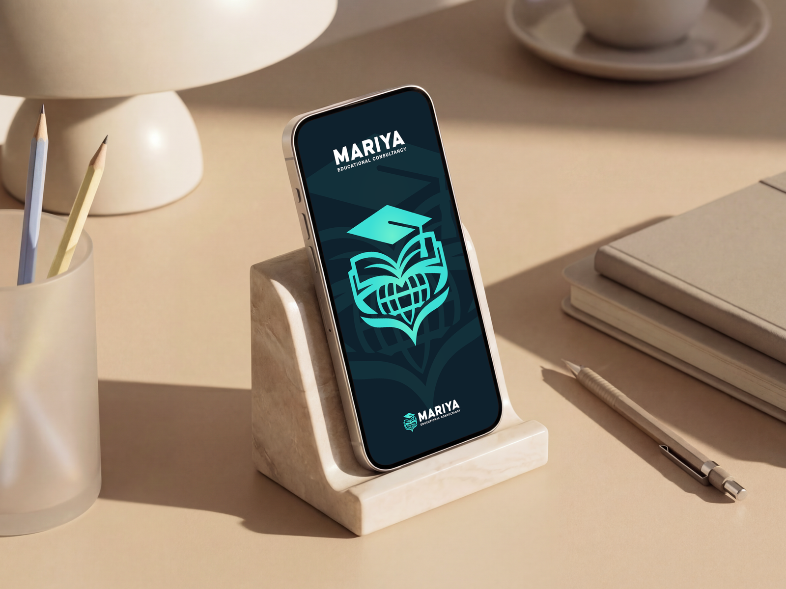
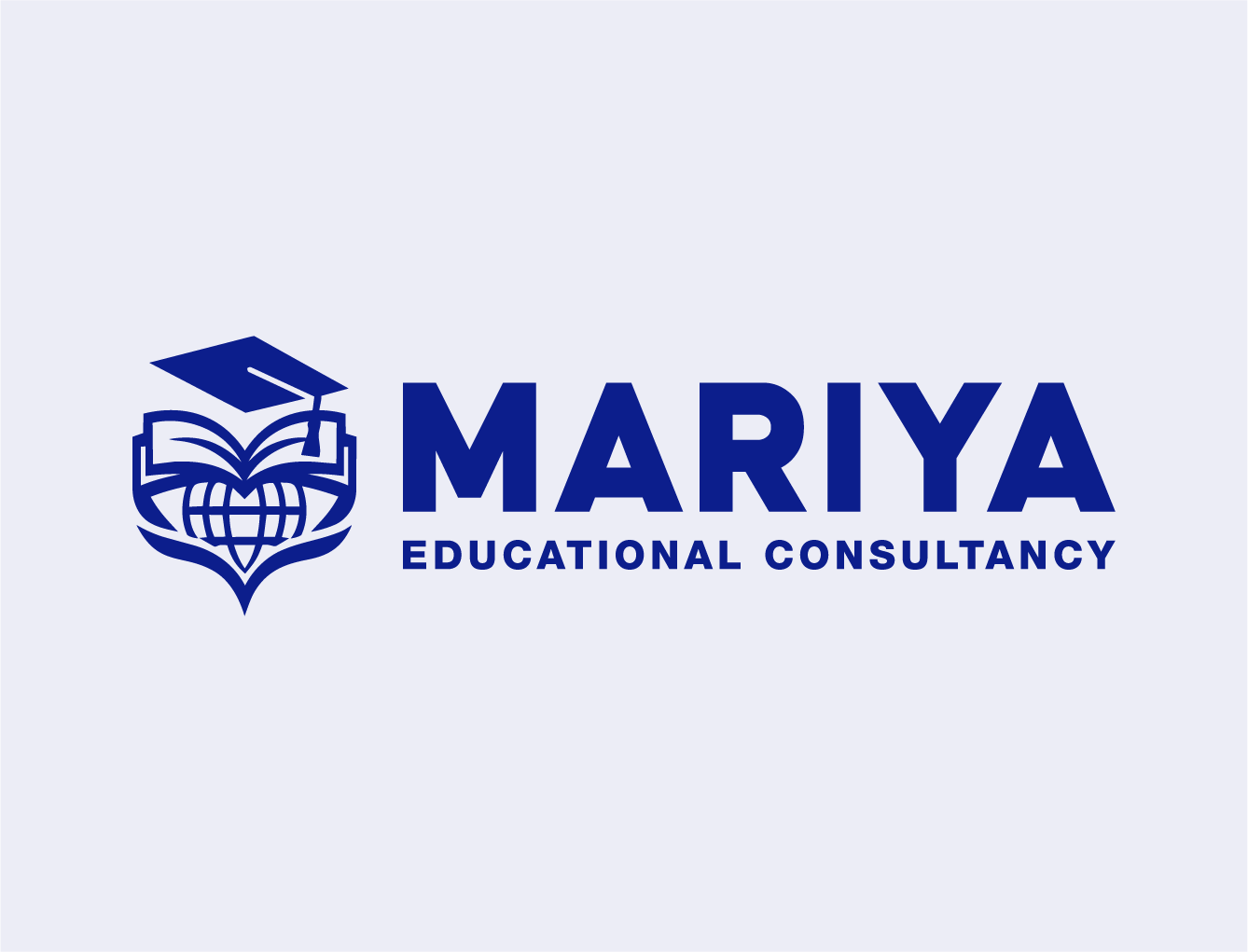
This logo mark tells a story of learning, care, and global opportunity. An open book forms the foundation, its pages shaped into a heart that symbolizes guidance, compassion, and the nurturing of knowledge. Within the heart rests a globe, representing worldwide reach and the boundless horizons of education.
Above the book sits a graduation cap, tilted with confidence, anchoring the design in academic achievement and success. Together, these elements create a symbol that blends inclusivity, authenticity, and empowerment. The mark transforms familiar icons of study into a cohesive emblem of trust, growth, and aspiration, making it both meaningful and memorable.

Logotype
The logotype of Mariya Educational Consultancy uses bold, confident typography to establish clarity and authority. The prominence of “MARIYA” conveys strength and recognition, while the supporting phrase “Educational Consultancy” anchors the identity in professionalism and trust. Its clean, straightforward design ensures legibility across all applications, reflecting the brand’s commitment to inclusivity, authenticity, and empowerment.
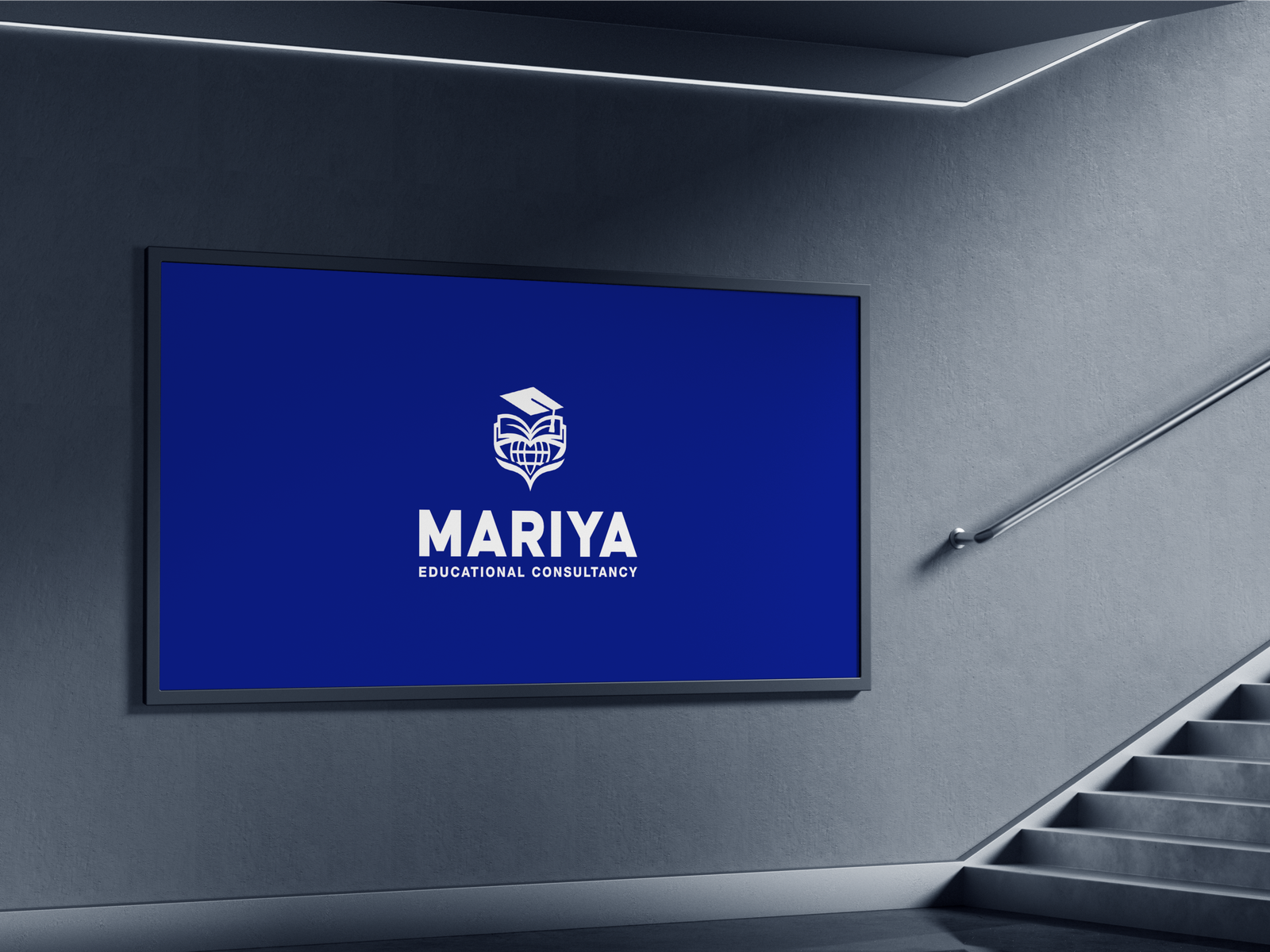
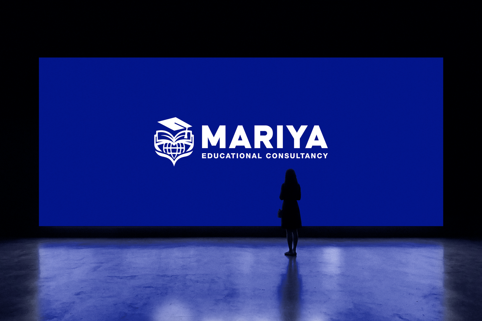
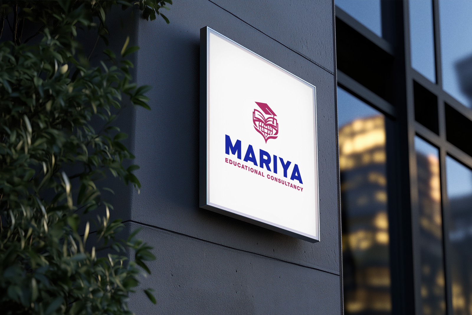
Full Logo
The full logo of Mariya Educational Consultancy integrates symbol and typography into one unified identity. The emblem introduces the narrative of care, global reach, and achievement, while the wordmark provides a strong, professional anchor. In combination, they create a complete brand expression that moves beyond individual elements, presenting Mariya as a trusted guide in education.
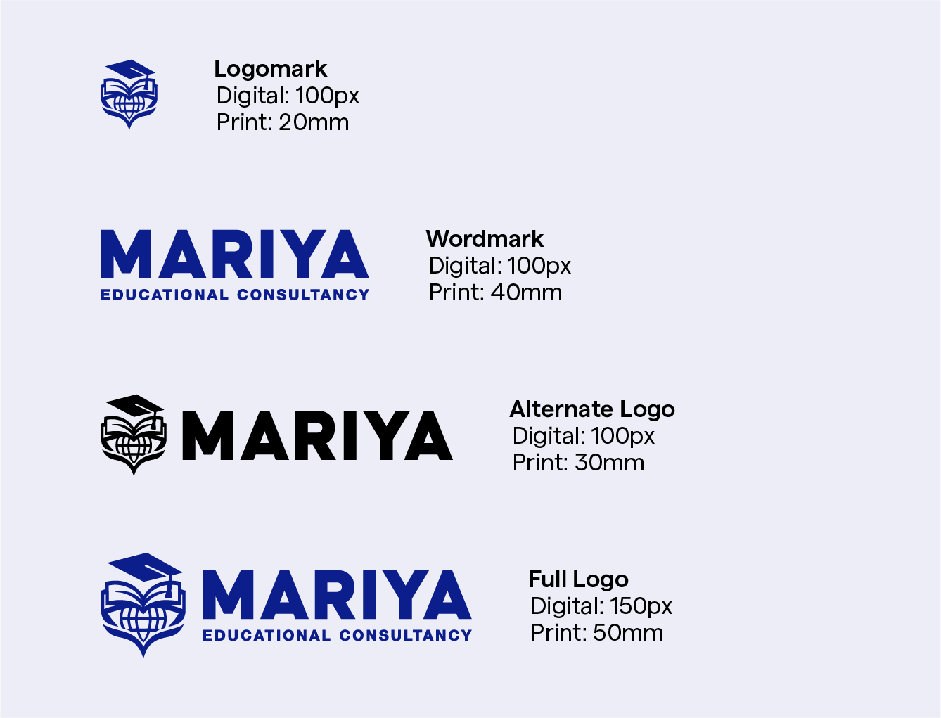
Minimum Size
To maintain legibility, the logo must neverbe reproduced at sizes smaller than the specified minimums. Adhering to these standards for both print and digital applications is essential to protect brand integrity. For Favicon, the first letter M can be used as the logo is too complex to adapt to favicon.
Clearspace
Clearspace defines the minimum protected area surrounding the logo. This breathing room must remain free of any other visual elements to preserve the logo’s prominence and impact.
Logo Dont’s
Always present the logo with clarity and consistency to uphold brand integrity.Avoid any modifications, distortions, or misuses that compromise its recognition and impact. This includes stretching, color swapping and such modifications. Every application must follow the established standards to ensure a strong and unified brand presence.
03. Brand Colors
Mariya Educational Consultancy
Colors
Color is a fundamental element of brand identity,evoking emotion and setting the tone for visual communication. The palette is organized into primary, secondary, tertiary, and custom colors. Primary colors establish the foundation of the brand, while secondary and custom shades provide flexibility to create a vibrant and dynamic visual language. Black and white colors are also used for various scenarios.
True Cobalt
HEX: #0C1D8D
RGB: 12, 29, 141
CYMK: 91%, 79%, 0%, 45%
Jet Black
HEX: #0E222F
RGB: 14, 34, 47
CYMK: 70%, 28%, 0%, 82%
Vintage Berry
HEX: #9A275A
RGB: 154, 39, 90
CYMK: 0%, 75%, 42%, 40%
Brick Red
HEX: #B91321
RGB: 185, 19, 33
CYMK: 0%, 90%, 82%, 27%
Parchment
HEX: #F2F0EB
RGB: 242, 240, 235
CYMK: 0%, 1%, 3%, 5%
Turquoise
HEX: #46E3D3
RGB: 70, 227, 211
CYMK: 69%, 0%, 6%, 11%
Lavender Mist
HEX: #EBEBF5
RGB: 235, 235, 245
CYMK: 4%, 4%, 0%, 4%
04. Typography
Mariya Educational Consultancy
Typeface
Brand’s primary typeface is Inter. Its clean, modern, and highly legible letter forms reflect the brand’s personality: confident, clear, and approachable.This versatile font family is applied across all brand communications to establish a consistent and unified typographic voice. Secondary typeface can be of any typeface that strictly follows human centric design.
Inter
A B C D E F G H I J K L M N O P Q R S T U V W X Y Z
a b c d e f g h i j k l m n o p q r s t u v w x y z
0 1 2 3 4 5 6 7 8 9
! ' ( ) * + , . / : ; < = > ? @ ^ & # $ ₹ _
05. Visual Outlook
Mariya Educational Consultancy