TWO
Introduction
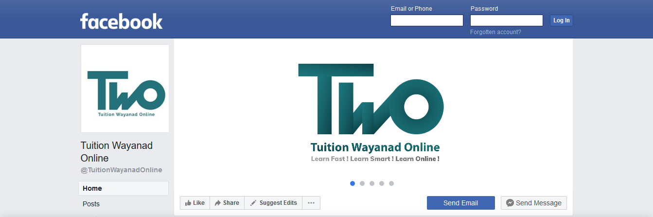
Tuition Wayanad Online (TWO) is a pioneering educational platform from Wayanad, designed to bring quality tuition directly to students through modern, technology‑driven methods. By blending institutional consistency with digital convenience, TWO creates a safe and accessible space where learners can connect with experienced tutors and achieve academic success from the comfort of home.
The brand reflects clarity, innovation, and trust, positioning itself as more than just a tuition centre. With its distinctive identity and emphasis on smart learning, TWO stands as a symbol of progress in education, encouraging students to embrace the future of learning with confidence and efficiency.
Tuition Wayanad Online LLP
Chief visionary officer (CVO), Designer, Digital Marketing Specialist
Nov. 2018 - Dec. 2021
Played a pivotal role in establishing TWO as a global tutoring platform. Led strategic initiatives, collaborated internationally to redefine digital learning standards, and strengthened brand visibility through digital content. Promoted the platform’s vision at key events, solidifying its outreach and impact.
Brand Position
Mission:
To provide online tuition that places subject knowledge directly at students’ fingertips, ensuring they access exactly what they need with ease and clarity.
Vision:
Empowering the world to teach and to learn through modern, technology‑driven techniques that make education interactive, accessible, and future‑focused.

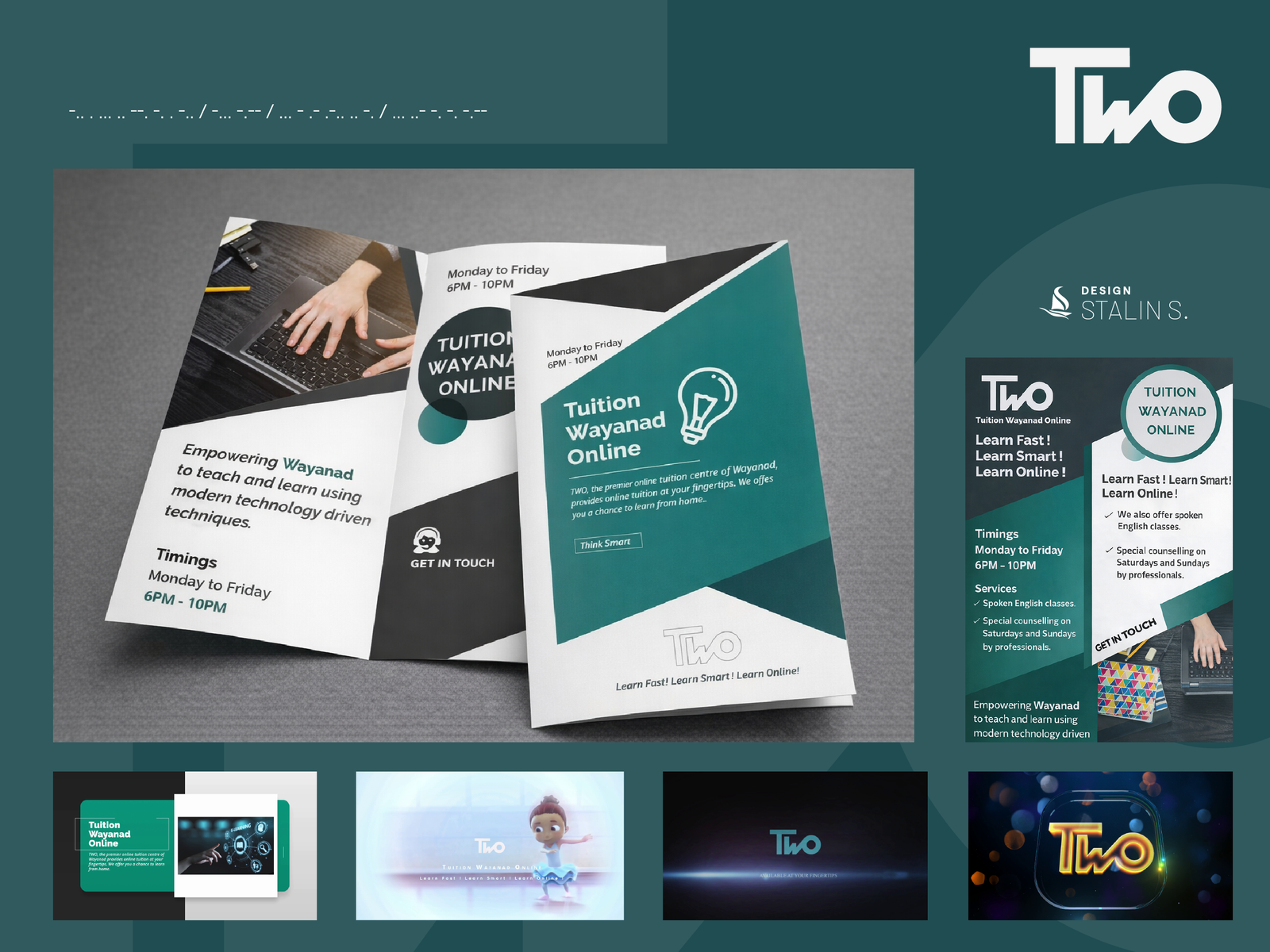
Logo Mark
The logomark serves as the brand’s iconic symbol, functioning as a compact identifier in digital spaces such as social media avatars, favicons, and other contexts where the brand presence is already established. Its bold, minimal form ensures immediate recognition and adaptability across platforms.
Co‑created with the team, the “Two” logomark is a modern typographic design that transforms a simple word into a distinctive emblem. The strong black lettering conveys clarity and boldness, while the seamless geometric connection between the “w” and “o” suggests unity and forward momentum, making the mark both functional and visually memorable.
Color Palette
Dark Cyan
HEX:#00897b
RGB:(0, 137, 123)
CMYK: 100%, 0%, 10%, 46%
Shadow Gray
HEX:#282828
RGB:(40, 40, 40)
CMYK:0%, 0%, 0%, 84%
Pine Teal
HEX: #00564d
RGB:(0, 86, 77)
CMYK: 100%, 0%, 10%, 66%
Grey Olive
HEX:#969696
RGB:(150, 150, 150)
CMYK: 0%, 0%, 0%, 41%
Graphite
HEX:#363636
RGB:(54, 54, 54)
CMYK: 0%, 0%, 0%, 79%
Black
HEX:#000000
RGB:(0, 0, 0)
CMYK: 0%, 0%, 0%, 100%
White
HEX:#ffffff
RGB:(255, 255, 255)
CMYK: 0%, 0%, 0%, 0%
Visual Outlook