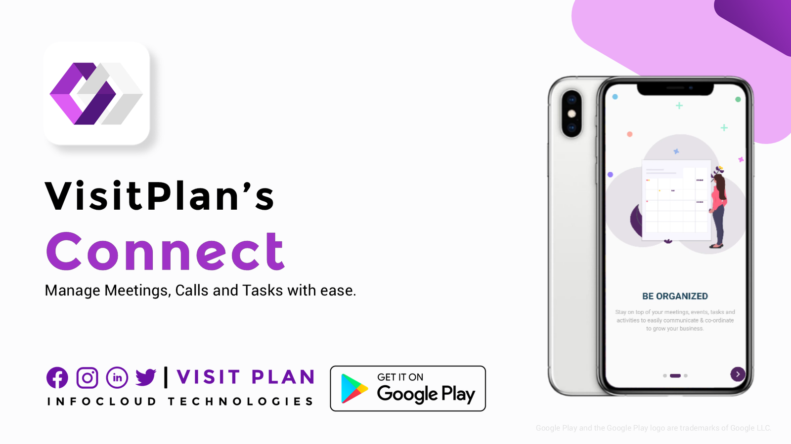
UX Stalin Logo Element
<linearGradient id="sl-pl-turn1-svg-grad01" linear-gradient(45deg, #000, #803100 49%, #800000 50%, #000)

UX Stalin

Project

VisitPlan

- Stalin Sunny -

Visit Plan Connect

UX Research, Design Feedback

Oct. 2020 - Dec. 2020

Visit Plan Connect by Infocloud Technologies, Bengaluru, a cloud-based prototype web application designed to manage customer visits and feedback during COVID-19, Designed to streamline internal processes, it delivers a seamless user experience by connecting touchpoints and ensuring efficient communication between teams and customers.

Key Contributions:

  • UX Research & Analysis: Conducted user research (surveys, usability testing) to understand customer and internal staff needs and pain points related to visit management.
  • Design Feedback & Recommendations: Provided critical and constructive feedback on wireframes and prototypes, identifying usability issues and suggesting UX/UI improvements based on research and best practices especially in the User onloading screens.
  • User-Centered Advocacy: Ensured design decisions were aligned with user research findings, advocating for a seamless and intuitive experience for both targeted customers and internal users.
  • Collaborative Design Process: Worked closely with the team, contributing to an iterative process that aimed to enhance the overall usability and effectiveness of the Visit Plan Connect application.

Prototype Design Review & Enhancements

User Registration & Login Flow

  • Adjusted logo size, placement, and shadows for consistency.
  • Introduced catchy headings and sub‑headings to improve engagement.
  • Enhanced transition animations for smoother user connection.
  • Updated iconography (replacing line art with unified icon design).
  • Applied consistent button colors and improved input field sizing.
  • Refined disclaimer and terms text placement for readability.
  • Integrated latest social login icons (Facebook, Google).

Contact & Activity Management Screens

  • Rewrote sub‑headings for clarity and appeal.
  • Corrected illustration orientation and shadows to avoid distortion.
  • Balanced secondary icon colors for better visual hierarchy.
  • Removed unnecessary background illustrations to reduce clutter.
  • Suggested minimal back icon instead of repeated “Pre” labels.
  • Added optional cloud and plant illustrations for visual warmth.

Event & Notification Screens

  • Improved illustration consistency across devices and cards.
  • Fixed fluent design alignment for UI elements.
  • Recommended small decorative illustrations for subtle branding.
  • Ensured button labels were unique to avoid repetition.

Account Creation & Verification

  • Standardized back button icon placement at the bottom.
  • Shifted layout focus downward for ergonomic flow.
  • Applied grammar corrections in password rules and lists.
  • Improved text color visibility for accessibility.
  • Added external privacy policy link for compliance.
  • Suggested illustrations at the top for visual balance.
  • Refined OTP verification screen with clearer text and improved layout.
  • Updated account verified screen with positive illustration.
Scroll to Top