Brothers Watch House
UXS-BWH-1125
Introduction
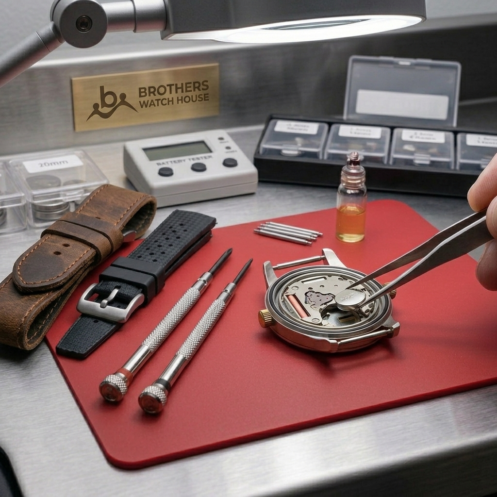
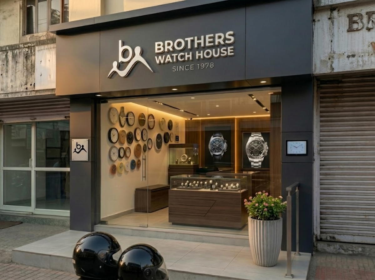
Brothers Watch House is a trusted destination for watch enthusiasts and everyday wearers, specializing in the sale and expert repair of timepieces. From classic heritage models to contemporary designs, the brand blends deep expertise with attentive service to ensure every watch is cared for with precision and authenticity. Each interaction is designed to inspire confidence, offering customers not just a product or repair, but a lasting relationship built on reliability and respect.
The brand reflects trust, expertise, and heritage, positioning itself as more than a store. With its distinctive identity and commitment to quality service, Brothers Watch House stands as a symbol of timeless connection, encouraging people to see their watches as companions that mark milestones, memories, and the rhythm of everyday life.
01. Brand Overview
Brothers Watch House
Brand Position
Mission:
Providing trusted watch sales and expert repair services that honor the tradition of timekeeping, ensuring every customer experiences reliability, authenticity, and care.
Vision:
To be the most dependable destination for watch enthusiasts and everyday wearers, where quality service, genuine products, and lasting relationships define the experience.
Purpose:
Preserving the value of time by offering carefully curated watches and precise repair services, fostering confidence, connection, and a culture built on trust and expertise.

02. Brand Logo
Brothers Watch House
Logo Mark
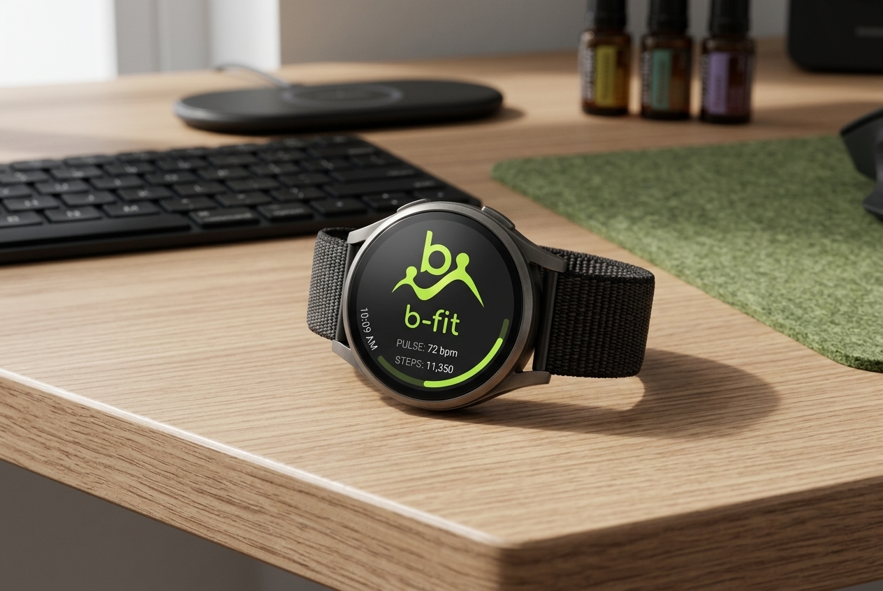
This logo mark tells a story of time and human connection. Two abstract figures holding hands form the dial of a clock, symbolizing relationships such as siblings, a parent and child, lovers, or friends. Their gesture conveys trust, unity, and continuity, reminding us that time is not only measured but shared.
The circular flow around them suggests movement and the journey of life, while the clock shape anchors the idea of precision and heritage. Together, these elements create a symbol that transforms the act of holding hands into a timeless reminder of companionship, making the logo both meaningful and memorable.

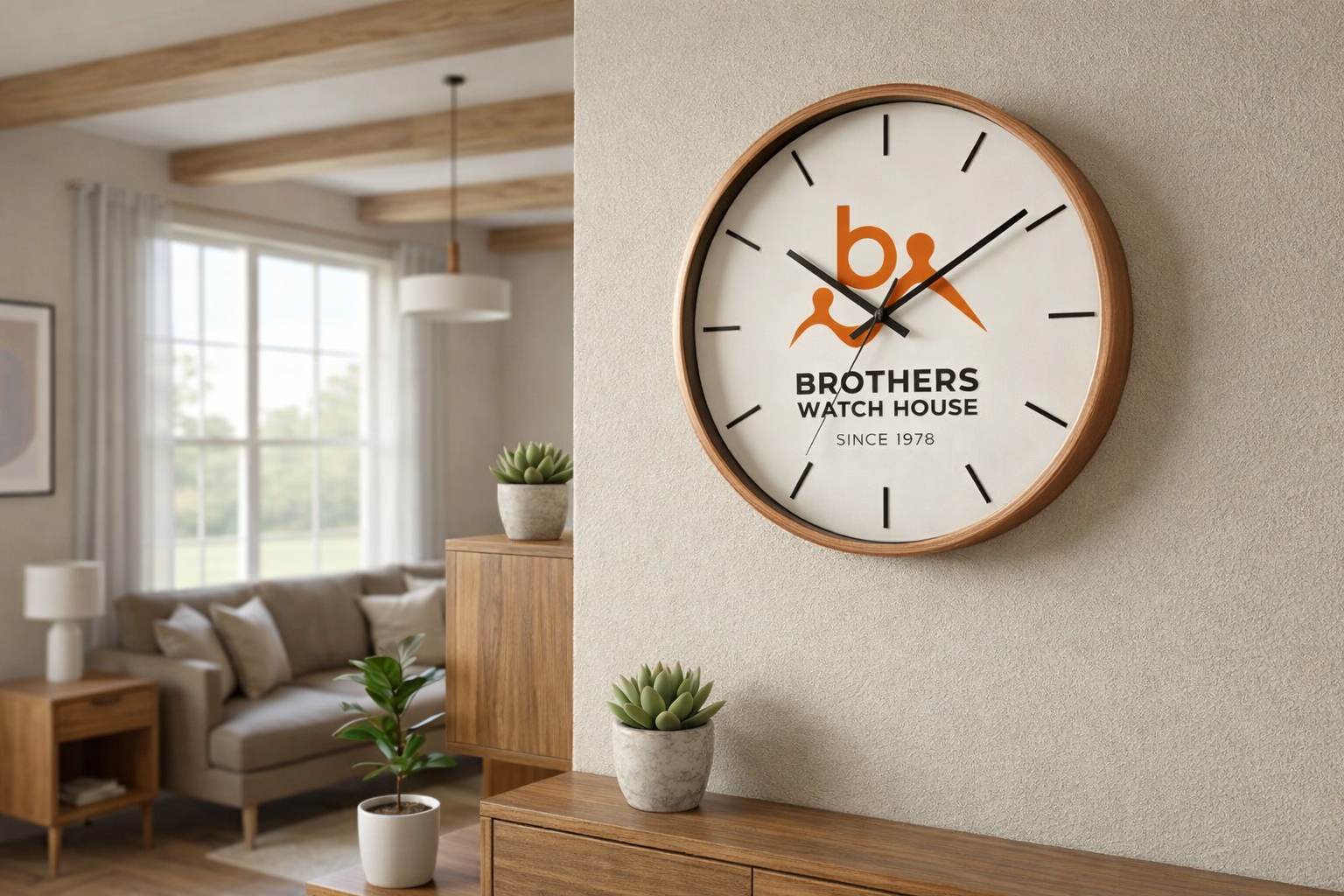
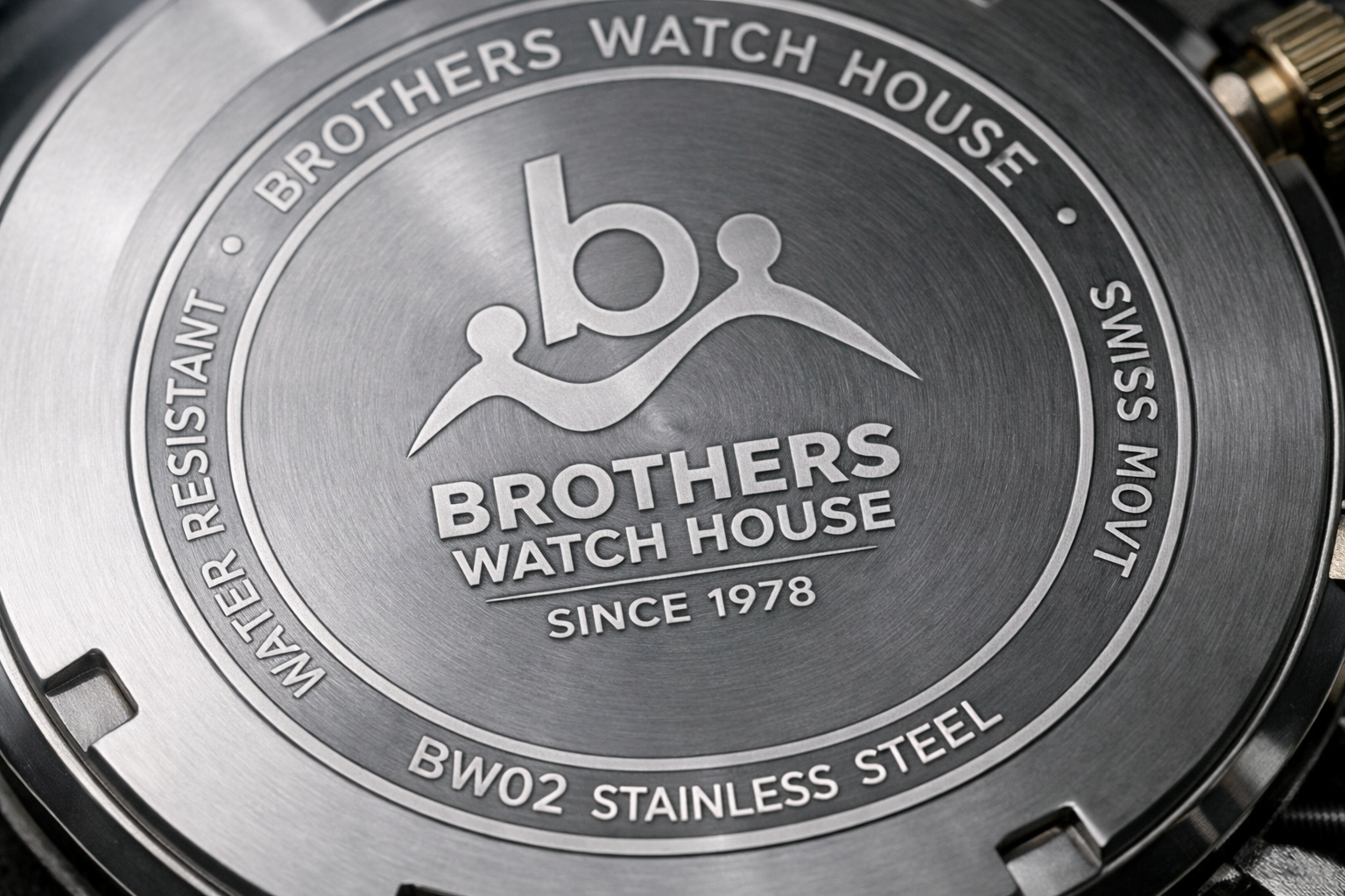
Logo Mark
The wordmark of Brothers Watch House uses confident typography that conveys precision and authority. The phrase “Since 1978” highlights heritage and long‑standing expertise, reinforcing trust built over decades. Its straightforward design ensures clear recognition and reflects the brand’s enduring commitment to craftsmanship and reliability.
Full Logo
The full logo of Brothers Watch House brings together symbol and typography into a unified identity. The emblem conveys human connection and the passage of time, while the wordmark grounds the brand in heritage and expertise. Together, they create a balanced composition that reflects precision, trust, and legacy, presenting the brand as both contemporary and enduring.
03. Brand Colors
Brothers Watch House
Colors
Color is a fundamental element of brand identity,evoking emotion and setting the tone for visual communication. The palette is organized into primary, secondary, tertiary, and custom colors. Primary colors establish the foundation of the brand, while secondary and custom shades provide flexibility to create a vibrant and dynamic visual language. Black and white colors are also used for various scenarios.
Yellow Green
HEX: #AEDF3B
RGB: 174, 223, 59
CMYK: 22%, 0%, 74%, 13%
Bright Indigo
HEX: #3C3ADF
RGB: 60, 58, 223
CMYK: 73%, 74%, 0%, 13%
Spicy Paprika
HEX: #DF603A
RGB: 223, 96, 58
CMYK: 0%, 57%, 74%, 13%
Turquoise
HEX: #3BDFCA
RGB: 59, 223, 202
CMYK: 74%, 0%, 9%, 13%
Indigo Velvet
HEX: #5A2D82
RGB: 90, 45, 130
CMYK: 31%, 65%, 0%, 49%
04. Typography
Brothers Watch House
Typeface
Our primary typeface is Montserrat. Its contemporary, geometric letterforms embody the studio’s personality: bold, versatile, and approachable.This font family is applied across all brand communications to establish a consistent and unified typographic voice. Montserrat’s balanced proportions and modern clarity ensure that our messaging remains impactful yet welcoming, aligning with the studio’s mission to empower fearless self‑expression through art.
Helvetica
A B C D E F G H I J K L M N O P Q R S T U V W X Y Z
a b c d e f g h i j k l m n o p q r s t u v w x y z
0 1 2 3 4 5 6 7 8 9
! ' ( ) * + , . / : ; < = > ? @ ^ & # $ ₹ _
05. Visual Outlook
Brothers Watch House